July 23, 2011

Roads and Houses

This may be the last painting I blog for a few weeks. CalArts has been a lot of work this summer so I haven't had much time to paint. I finished this a few weeks ago. I'm quite happy how this turned out but it was a real struggle making it work. I really strive for a painting to be abstract but at the same time totally recognizable.
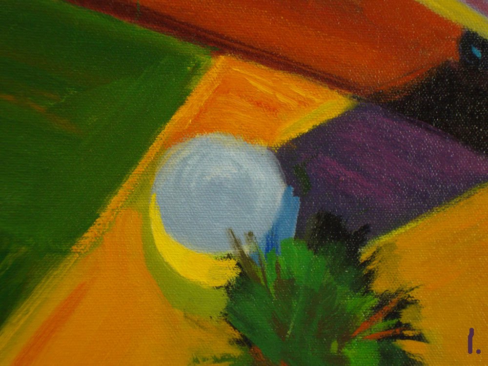
Detail #1. I finished the entire painting but was only happy with this part, so it's what I kept and completely changed the rest. Green and purple are a very strange color combination but I wanted to try to make them work because I really liked the part above.
Detail #2. Hopefully you can see how abstract this painting is from some of these details. Although ultimately I shoot for everything to make sense, as if I was actually painting on location, I want every paint stroke, every splotch of color, etc. to be completely abstract.
Detail #3. More stuff.
Detail #4. It's easier to see how abstract this is when looking at a small piece of the painting.

July 16, 2011

Red Truck

27" x 36" oil on canvas. Sorry that I've kind of dropped off the map. Even though it's summer I've had a ton to do at CalArts. I'm actually getting a little crispy on the edges and will be more than ready for some time off before school starts in September. Another example of how I like a painting to work 2D and at the same time 3D.
Detail #1 This photo's a little soft. I think the camera was too close to the painting, sorry.
Detail #2 What I usually shoot for is a painting that reads very quickly...maybe 5 seconds, and yet is so interesting that you could look at it a thousand times and still see something new. Of course I wish I was always successful at it.
Detail #3 The splotch of yellow paint near the hood of the truck is slightly green. Green is the complement of red so it makes the truck stand out more than a warm yellow would.
Detail #4 Some things, like the yellow horizontal line, are simply for visual interest...it's not to represent anything, it's just for visual interest.

June 7, 2011

Big Red Cloud

40" x 48" oil on canvas. I wanted to make the cloud seem huge so I made some real tiny houses on the bottom of the painting.

Detail #1. This is pretty close to the actual size of the houses...as you can see they're fairly lose.

Detail #2. The color of the cloud is an orangeish red. What I think is interesting is that for some reason this made the cloud look like it's somewhere in the midwest...


Detail #3 I think maybe the midwest thing has something to do with the sky color too.


Detail #4

June 4, 2011

Trees

18" x 24" oil on canvas. I'm trying out a different layout to see if the weirdness with the text goes away or is equally weird. When the painting is on the left and the text is on the right the relationship between painting and text often gets completely messed up for some reason. This painting is super simple and fairly small. Even with something simple like this I always shoot for interesting design. In fact I never even start a painting without thinking design.

Detail #1 Super simple. There's probably a great book out there on design but I'm not familiar with it. The way I learned design was based on how it was taught at the Bauhaus in Germany in 1919-1933.

Detail #2 Also I shoot for color relationships...colors that work well together. I may not be phenomenal at color but colors that work well together is something important to me.


Detail #3 Once again pretty simple...maybe too simple, but the jury's still out.

May 30, 2011

Overlooking Water

22" x 30" oil on canvas.
Another fairly rough painting. I'm not at all satisfied with the sky color but decided to upload this image anyway. It's not at all unusual for me to finish a painting only to realize later I want to change something...that's just sort of the way I work. Maybe I'll be working on a painting and put it aside for a day or a month and look at it and realize I hate the color of this, or the shape of that.


Detail #2 Sorry that the numbering is somewhat messed up. I was going to add another detail and decided not to at the last minute. The two light things in the water are supposed to be boats. I decided to make them simply paint strokes to see if they'd read as boats...and I think they do.


Detail #3 Nothing amazing.


Detail #4

March 26, 2011

After Rain

36" x 48" oil on canvas.
Well it's spring break and even though my son brought his camera it has been raining or cloudy all week, so the light has been too cool to photograph anything. However this image was on my hard drive.
When starting this painting I was going to make the houses that are in sunlight in a continuous horizontal band, but very quickly I could see it wasn't going to work. So as you can see I didn't do that.


Detail #1. Here's another case where I ruffed out the shrub and then painted the negative space (the lawn) to define it. I like the look of that MUCH more than painting the grass before painting the shrub.


Detail #2. Ditto.


Detail #3. The windows and other stuff are just splotches of color.


Detail #4. More splotches of color.

February 16, 2011

Yellow Stripe

36" x 48" oil on canvas.
I probably won't post anything until spring break when my son is back from school with his camera. I'll have to see if I have images for one more painting on my hard drive.
Here everything was kind of back lit and from the left so I could get the purpleish (is that a word?) shadow on the ground.


Detail #1 I painted the sky several times because I wasn't happy with the color. I remember it started out blue but I think blue is kind of a twinky color for sky. Also, if it was blue it wouldn't make the hills in the distance be anything special.
If I remember correctly another time it was sort of pinkish.

Detail #2. Another shot of the background hill. Now that I look at it the orangeish highlights on the distant trees is too dark, so it doesn't work as light.
I like the way the yellow field is mostly just a horizontal line.


Detail #3. Now I see that the values could have been pushed farther.


Detail #4. The paint that breaks the shadow on the bottom was just runny paint. Here again I can see now that the value of the shadow could have been pushed farther...next painting.

February 10, 2011

Houses Near Water #1

40" x 48" oil on canvas.
Another of the 3/4 down shots. I wanted to try something quite different than the others I had done.


Detail #1. Sorry if these notes aren't lined up properly with the images. It seems to be something screwy with the blog, and I've gotten tired of trying to line up the type since it's different every time.
The paint is pretty thin so you can kind of see the painting underneath.


Detail #2 The paint here's pretty thin too.


Detail #3 Fairly abstract.

February 3, 2011

Red Truck #2

40" x 48" oil on canvas.
Ok so it looks like a maroon colored truck rather than a red one. But who in their right mind would want to buy a painting called "Maroon Truck #2"? Another 3/4 down shot...or at least that's what I call these. As I've said previously I like them to work 2D and at the same time 3D. I'm usually a pretty slow painter but this only took about 2 or 3 days.


Detail #1 Nothing amazing here but the paint for the ground was pretty runny. I know painters who always make the brush strokes describe the form...so if they're painting the ground, for instance, the brush strokes will go in the direction of the ground. However I almost never do that because I want the painting to be 2D rather than just a representation of a 3D object.


Detail #2 This is an example of how I like to ruff in something (in this case the shadow) and then create its shape by painting the negative shape...in this case the ground.


Detail #3 A board in light and in shadow.


Detail #4 Light and shadow...the shadow isn't black but that's how it looks in this photo.

January 28, 2011

Fishing Cabins

20" x 24" oil on canvas.
Another small one. Again I tried graphic shapes on the water to add interest. However I don't think they're 100% successful.


Detail #1 the image of the boats is much bigger than on the painting.


Detail #2 Also much bigger than on the painting. One thing I frequently do, and you can see it here somewhat, is that rather than painting the positive shape I paint the negative shape. (Here as an example I painted the grass, and that creates the shape of the house.) Doing so not only creates the positive shape, but creates visual interest.

Detail #3 Here again you can kind of see that rather than paint the shrubs and shadows I painted the grass...and that described the shapes of the shrubs and shadows.


January 22, 2011

Long Shadows

36" x 48" oil on canvas.
This is another of the 3/4 down shots. I painted three or four of these (different subjects of course), to see if I could create interesting paintings.


Detail #1 The color in this painting is pretty rich but you'd never know it from this photo.


Detail #2. I know this is the stupidest reason for a vertical photo but I wanted to see if it would show up or if it would get clipped on the blog...sorry but that really was the reason.


Detail #3 Playing again with the color of light and the color of shadow. Not 100% successful though.