December 30, 2010

Tree and Houses

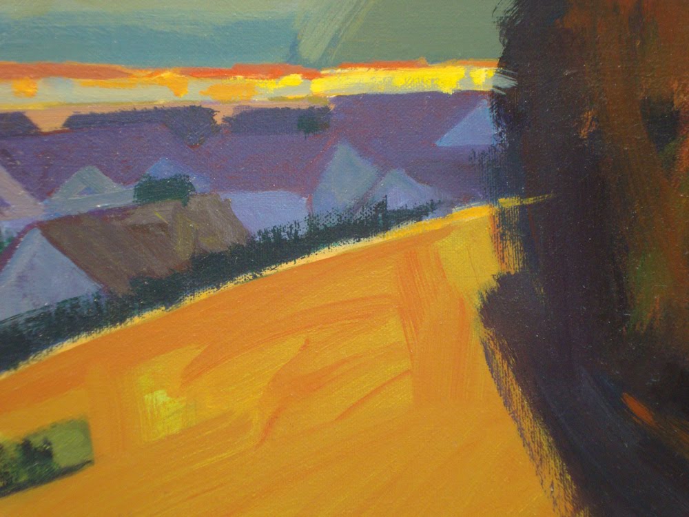
24" x 30" oil on canvas.
The colors in this painting were influenced by something I saw several years ago. When we were working on "Pocahontas" in Glendale, there was a fire across the freeway in Griffith Park. At that time several of us were in a temporary building right next to the directors.

As I was walking to see the directors, I noticed that because of the smoke in the air the sidewalk was pink and the shadows were a very intense blue.

It's probably completely obvious to someone else but at that point I began to realize that sunlight actually had a COLOR and that shadows had a COLOR too. A lot of painters add just WHITE to lighten something, and they mix BLACK to make shadows. I don't even own a tube of black paint because ever since the fire it drives me crazy how it's often used. It's great to use black as a COLOR, like if someone is wearing a black t-shirt or is driving a black car. But to use it as the color for a shadow kills me.


2. I often like to paint fairly loosely but make things look completely recognizable.


3. Also as you can tell I don't like rendering.


4. The shadows in this photo might look like I used black but I guarantee you I didn't.


5. Depending on what I'm painting I might use Pthalo Blue or Alizerine Crimson or something like that for a shadow color.


Reservoir and Truck

40" x 48" oil on canvas.
1. I posted this painting previously but for some reason it didn't show up.
This photo is a little over exposed but I was too lazy to shoot it again. This size is what I prefer but I'm trying to get used to painting smaller.

Even though I usually paint somewhat loosely the paint is pretty thinned out with turp because I like to show what's underneath.
This is how I like to play with 2D and 3D.


4. In this image the rectangle on the right is actually more orange than yellow...it's the same as the orange field in the image above.

December 29, 2010

Houses Near Water

22" x 30" oil on canvas.
To take this photo the painting was lit by lights on the right and left, and I couldn't gt rid of the glare on the upper left.

I didn't want to paint a blue sky because the majority of the painting is blue ocean. However I wanted to paint it a color that wouldn't be distracting (as it would be if there was too much contrast between the ocean and sky), and worked well with the color of light in the painting.

It may be difficult to see but the sky is actually two horizontal bands of orange...a lighter orange on the bottom and a darker band of orange on the top. It may sound silly but I painted it four or five times to get the colors and values right. Also I wanted the island with houses to be the focal point and not the sky.

As I was doing this painting I decided to make the water have a graphic pattern which I think is pretty successful. The ocean takes up so much of the painting and I wanted to see if I could get a pattern to work.
2.As usual I wanted the light to have a color, and the shadow to have a color too.

3. The light and shadow colors for the foreground houses is the same as on the island houses. However they don't distract from the main focal point.

4. I like the design created by the palm trees. The pattern on the water is interesting too.


Fields

27" x 36" oil on canvas.
1. I might have said previously that painting is a struggle for me, but I like the look of that struggle. I'll paint something, then possibly change the color, or often change the shapes until it looks right. However I don't block out the "mistakes" because the finished painting looks better to me when they are visible. This painting has lots and lots of things like that. It's easiest to see on the two closest fields on the right...you can see what was painted earlier. Or look at the white building that's closest. You can see the light color in the dark side of the building. I really like stuff like that. I think it makes the painting much more interesting. So the painting looks entirely recognizable but it's really an abstract.

2. In the green field you can also see what was painted underneath.

3. You can also see the underpainting on the field on the right. To me it makes the painting much more interesting than if the "mistakes" were completely covered.

4. You can see it once again on the field on the right side, and in the wide "white" band. In fact there's yellow and pink that show thru on that band of light pink and pale yellow.


Lompoc Flower Fields

18" x 24" oil on canvas.
1. Another small one. Whether painting large or small the format is often the same 'cause I don't like them too rectangular.

2. Although the shadow side of the shrub might look like it's black it's not really. I probably used mainly Alizerine Crimson and maybe knocked down the intensity with Pthalo Green.

As you can see the shadow on the ground from the shrub is a cool blue.


Produce Stand

27" x 36" oil on canvas.
Although I like this painting now I worked and worked on it. As I said previously I like to play with 2D and 3D. That is I like the paintings to work three dimensionally but at the same time work as flat shapes. That's why the trees in the distance are essentially a horizontal band of color.


Detail #1 Once again the light and shadow have color, they're not simply white and gray.

Detail #2The trees are splotches of color which describe the light and shadow sides.


Detail #4 The part of the sign in light is pinker than it turned out in this photo.


House and Reservoir

18" x 24" oil on canvas.
This is another small one. I like the way "mistakes" look so I usually don't try to cover them entirely. Probably the easiest place to see that is on the sky. I loosely painted it the lighter color and then later decided to paint it slightly bluer (is "bluer" even a real word?)


After roughing in this hill I painted the orange line. Even though it looks like a field or something it's just an orange horizontal linle to me.


Houses on Hill #3

20" x 24" oil on canvas.
Hopefully this image isn't too soft since it's the only one I still have for this painting.

I always paint in oil 'cause I like the way it looks and feels. Also I like the fact that the colors are the same when they dry as when they're wet.

Acrylics aren't that way. They're slightly darker and the colors are more intense (brighter) when wet. Don't get me wrong, there are some amazing artists who love to work in acrylics. I just don't happen to be one of them.