May 30, 2011

Overlooking Water

22" x 30" oil on canvas.
Another fairly rough painting. I'm not at all satisfied with the sky color but decided to upload this image anyway. It's not at all unusual for me to finish a painting only to realize later I want to change something...that's just sort of the way I work. Maybe I'll be working on a painting and put it aside for a day or a month and look at it and realize I hate the color of this, or the shape of that.


Detail #2 Sorry that the numbering is somewhat messed up. I was going to add another detail and decided not to at the last minute. The two light things in the water are supposed to be boats. I decided to make them simply paint strokes to see if they'd read as boats...and I think they do.


Detail #3 Nothing amazing.


Detail #4

March 26, 2011

After Rain

36" x 48" oil on canvas.
Well it's spring break and even though my son brought his camera it has been raining or cloudy all week, so the light has been too cool to photograph anything. However this image was on my hard drive.
When starting this painting I was going to make the houses that are in sunlight in a continuous horizontal band, but very quickly I could see it wasn't going to work. So as you can see I didn't do that.


Detail #1. Here's another case where I ruffed out the shrub and then painted the negative space (the lawn) to define it. I like the look of that MUCH more than painting the grass before painting the shrub.


Detail #2. Ditto.


Detail #3. The windows and other stuff are just splotches of color.


Detail #4. More splotches of color.

February 16, 2011

Yellow Stripe

36" x 48" oil on canvas.
I probably won't post anything until spring break when my son is back from school with his camera. I'll have to see if I have images for one more painting on my hard drive.
Here everything was kind of back lit and from the left so I could get the purpleish (is that a word?) shadow on the ground.


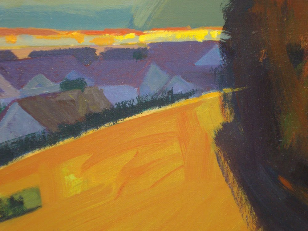
Detail #1 I painted the sky several times because I wasn't happy with the color. I remember it started out blue but I think blue is kind of a twinky color for sky. Also, if it was blue it wouldn't make the hills in the distance be anything special.
If I remember correctly another time it was sort of pinkish.

Detail #2. Another shot of the background hill. Now that I look at it the orangeish highlights on the distant trees is too dark, so it doesn't work as light.
I like the way the yellow field is mostly just a horizontal line.


Detail #3. Now I see that the values could have been pushed farther.


Detail #4. The paint that breaks the shadow on the bottom was just runny paint. Here again I can see now that the value of the shadow could have been pushed farther...next painting.

February 10, 2011

Houses Near Water #1

40" x 48" oil on canvas.
Another of the 3/4 down shots. I wanted to try something quite different than the others I had done.


Detail #1. Sorry if these notes aren't lined up properly with the images. It seems to be something screwy with the blog, and I've gotten tired of trying to line up the type since it's different every time.
The paint is pretty thin so you can kind of see the painting underneath.


Detail #2 The paint here's pretty thin too.


Detail #3 Fairly abstract.

February 3, 2011

Red Truck #2

40" x 48" oil on canvas.
Ok so it looks like a maroon colored truck rather than a red one. But who in their right mind would want to buy a painting called "Maroon Truck #2"? Another 3/4 down shot...or at least that's what I call these. As I've said previously I like them to work 2D and at the same time 3D. I'm usually a pretty slow painter but this only took about 2 or 3 days.


Detail #1 Nothing amazing here but the paint for the ground was pretty runny. I know painters who always make the brush strokes describe the form...so if they're painting the ground, for instance, the brush strokes will go in the direction of the ground. However I almost never do that because I want the painting to be 2D rather than just a representation of a 3D object.


Detail #2 This is an example of how I like to ruff in something (in this case the shadow) and then create its shape by painting the negative shape...in this case the ground.


Detail #3 A board in light and in shadow.


Detail #4 Light and shadow...the shadow isn't black but that's how it looks in this photo.

January 28, 2011

Fishing Cabins

20" x 24" oil on canvas.
Another small one. Again I tried graphic shapes on the water to add interest. However I don't think they're 100% successful.


Detail #1 the image of the boats is much bigger than on the painting.


Detail #2 Also much bigger than on the painting. One thing I frequently do, and you can see it here somewhat, is that rather than painting the positive shape I paint the negative shape. (Here as an example I painted the grass, and that creates the shape of the house.) Doing so not only creates the positive shape, but creates visual interest.

Detail #3 Here again you can kind of see that rather than paint the shrubs and shadows I painted the grass...and that described the shapes of the shrubs and shadows.


January 22, 2011

Long Shadows

36" x 48" oil on canvas.
This is another of the 3/4 down shots. I painted three or four of these (different subjects of course), to see if I could create interesting paintings.


Detail #1 The color in this painting is pretty rich but you'd never know it from this photo.


Detail #2. I know this is the stupidest reason for a vertical photo but I wanted to see if it would show up or if it would get clipped on the blog...sorry but that really was the reason.


Detail #3 Playing again with the color of light and the color of shadow. Not 100% successful though.

January 15, 2011

Green Truck

36" x 48" oil on canvas.

I made a few paintings like this 3/4 down shot which are kind of interesting because they're fairly geometric or graphic. Some of you are going to find these way too severe, and that's fine.


Detail #1 Even the shrubs are these funny little geometric things.


Detail #2 It's really unlike me to do a painting using all straight lines.


Detail #3 Even though this painting is very unlike my other work one thing I always use is the COLOR of light and the COLOR of shadow. They're not simply a matter of using white and black (or gray.)


January 10, 2011

Big Blue Sky

40" x 48" oil on canvas.

I wanted to see if I could make an interesting painting with the main subject in just a strip on the bottom. So the colors of the houses and stuff are fairly intense in this painting but I think they work pretty well.


Detail #1. There's a very slight value difference between the sky on the right and that on the left.


Detail #2. Here you can see the use of color that makes the houses and fields interesting. They could be pretty bland otherwise.


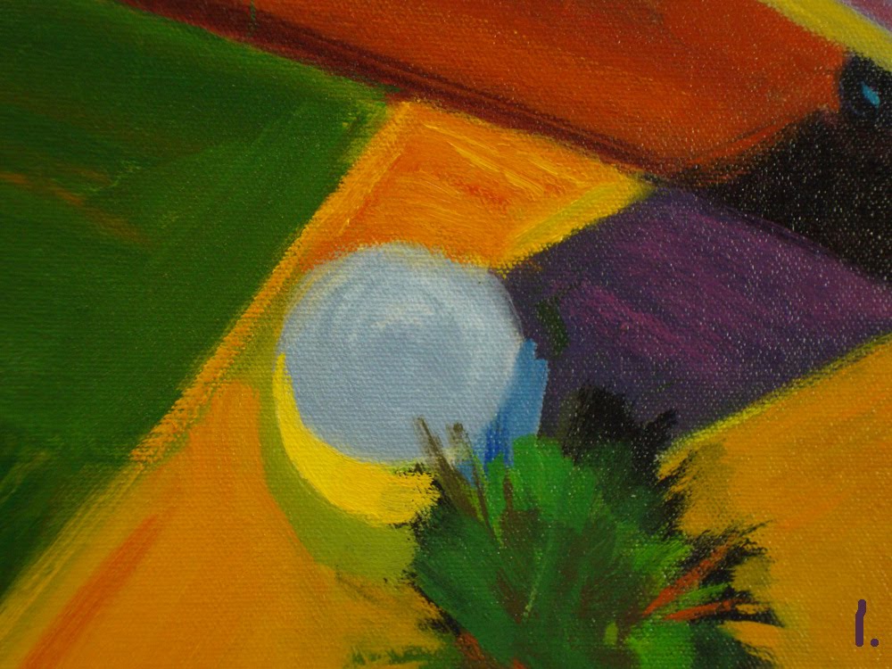
Detail #3. I tried to make these palm trees read as palm trees even though they're shaped kind of like Q-Tips.


January 4, 2011

House on Green and Brown

30" x 36" oil on canvas.
I don't know why the house came out so bland in this photo 'cause it's color is actually quite rich. In the painting the color is definitely affected by the color of the sunlight. So even though it's supposed to look like a white house it's fairly golden colored. I photographed this painting in the afternoon, but since it was lightly raining outside the color in the image is somewhat cool.

Detail #1 The color of the house in this image is more accurate than the one above. The color of the roof isn't dark gray, it leans more toward a cool red so it looks like a cool terracotta.


Detail #2 The distant hill is more blue on the right of the trees and more purple on the left. The value and intensity are essentially the same so it reads as one thing and not two. The green field is slightly more intense on the right.

December 30, 2010

Tree and Houses

24" x 30" oil on canvas.
The colors in this painting were influenced by something I saw several years ago. When we were working on "Pocahontas" in Glendale, there was a fire across the freeway in Griffith Park. At that time several of us were in a temporary building right next to the directors.

As I was walking to see the directors, I noticed that because of the smoke in the air the sidewalk was pink and the shadows were a very intense blue.

It's probably completely obvious to someone else but at that point I began to realize that sunlight actually had a COLOR and that shadows had a COLOR too. A lot of painters add just WHITE to lighten something, and they mix BLACK to make shadows. I don't even own a tube of black paint because ever since the fire it drives me crazy how it's often used. It's great to use black as a COLOR, like if someone is wearing a black t-shirt or is driving a black car. But to use it as the color for a shadow kills me.


2. I often like to paint fairly loosely but make things look completely recognizable.


3. Also as you can tell I don't like rendering.


4. The shadows in this photo might look like I used black but I guarantee you I didn't.


5. Depending on what I'm painting I might use Pthalo Blue or Alizerine Crimson or something like that for a shadow color.


Reservoir and Truck

40" x 48" oil on canvas.
1. I posted this painting previously but for some reason it didn't show up.
This photo is a little over exposed but I was too lazy to shoot it again. This size is what I prefer but I'm trying to get used to painting smaller.

Even though I usually paint somewhat loosely the paint is pretty thinned out with turp because I like to show what's underneath.
This is how I like to play with 2D and 3D.


4. In this image the rectangle on the right is actually more orange than yellow...it's the same as the orange field in the image above.